
Stanford Momentum


Stanford Momentum presented a significant opportunity for our team. The client asked for a website that diverged from the usual Stanford aesthetic and incorporated cinematic storytelling elements. This challenge pushed me to build a design system that was not only technically robust but also forward-thinking.
Client:
Stanford Office of Development
Partners:
Kerri Augenstein, Design, Stanford Web Services
Yvonne Tang, Development, Stanford Web Services
Andy Bell, Project Management, Stanford Web Services
My Role:
I had the privilege of working closely with Kerri Augenstein, who set the strategic vision, while I focused on translating that vision into detailed, technical design.
Discovery
In the early stages, Kerri and I reviewed the client’s existing brand guidelines and print materials, which were visually striking but needed adaptation for the web. We wanted to ensure that the bold design elements - such as strong typography, imagery, and graphic treatments - would translate into the digital space without negatively impacting usability, accessibility, or performance.
We also explored other storytelling websites to understand how the digital medium could enhance the narrative experience. Unlike print, the web allows for dynamic elements that engage users in different ways - such as interactive animations, video backgrounds, and fluid layouts.
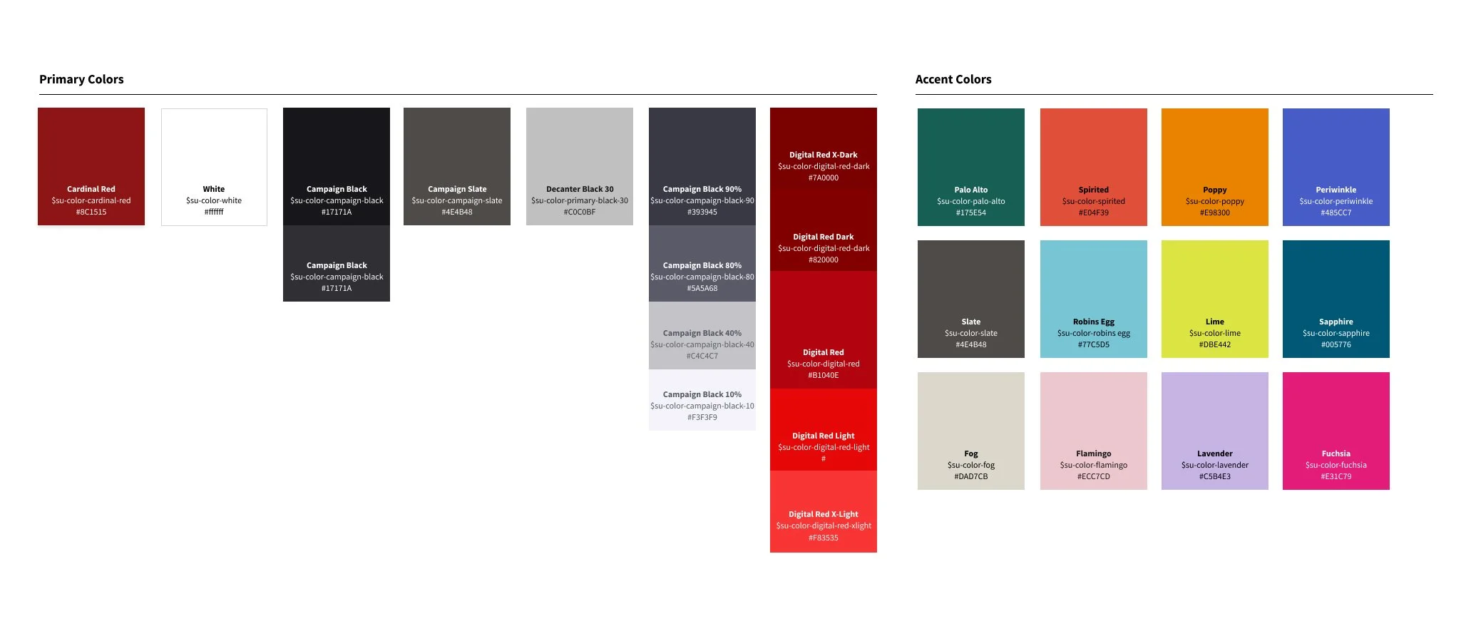
The brand's color palette featured vibrant neon hues, contrasting with the traditional black and Cardinal red associated with Stanford websites. We chose to use these neons as accents, balancing a departure from the usual aesthetic while maintaining a connection to the university's visual identity.
Iteration, collaboration, and flexibility
A key factor in the project’s success was the ability to collaborate frequently - thanks to the healthy budget. As Kerri and I began sketching design concepts, we had the ability to meet with the client two times a week. This created a steady feedback loop that kept the design moving forward at a rapid pace.
As the project evolved, I transformed our sketches into a flexible design system that could support a wide variety of content while maintaining a cohesive visual identity. This system included reusable UI components, typography styles, and color schemes.
The system’s flexibility was especially valuable when the brand guidelines shifted multiple times throughout the project. Because we had a robust design system in place, these changes didn’t hinder progress. Instead, they presented opportunities for experimentation and creativity. I truly enjoyed the freedom to explore fresh ideas, which was one of the most rewarding aspects of this project.
The iterative process extended beyond client feedback. As I translated our sketches into a design system, I worked closely with our developer, Yvonne Tang, to understand technical constraints. We had regular conversations via Slack and Zoom, tackling everything from small component tweaks to larger structural decisions. This real-time collaboration allowed us to adjust designs quickly, adapt to technical challenges, and explore creative solutions together.
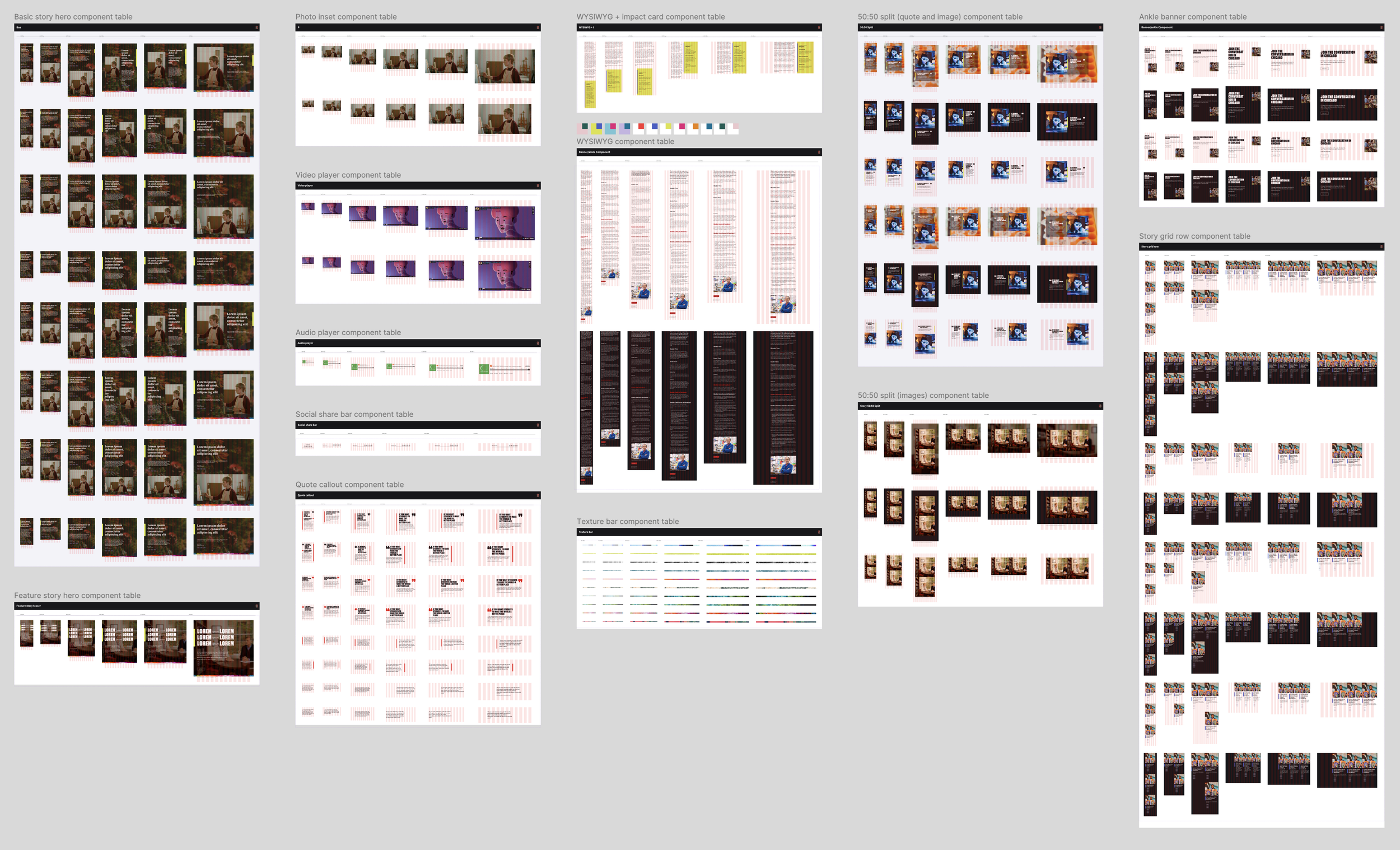
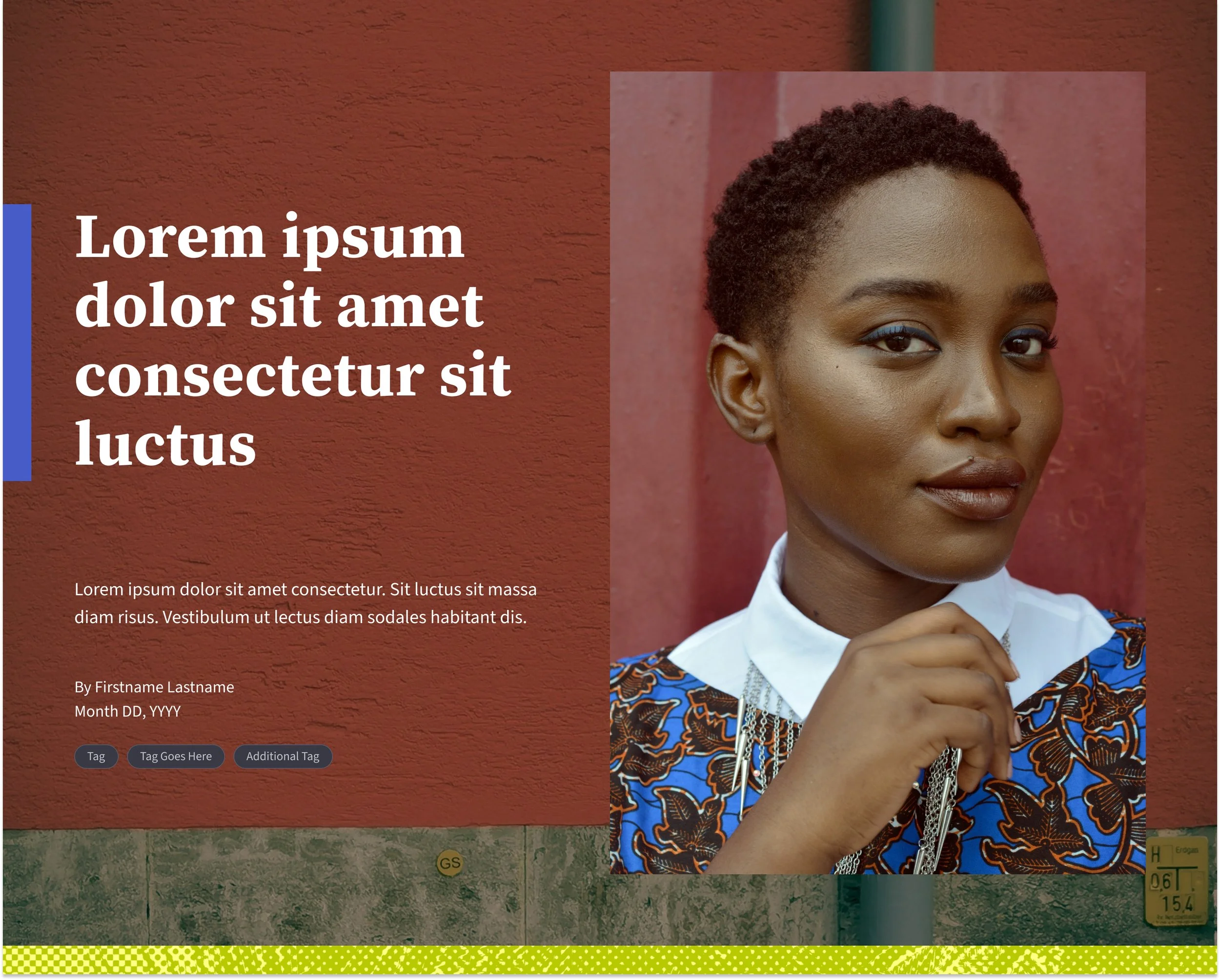
Components for basic story pages
Accessibility and inclusivity
Yvonne and I also worked closely with the Office of Digital Accessibility at Stanford to ensure the site adhered to WCAG guidelines and met the highest standards of inclusivity.
We focused on several key aspects to enhance accessibility:
Color Contrast: Given the brand’s use of bold colors, we paid special attention to ensuring sufficient contrast between text and background colors. We tested every color combination to meet WCAG contrast ratios, ensuring readability for users with visual impairments.
Typography & Readability: We adjusted font sizes and line spacing to optimize legibility for users with low vision and dyslexia. By implementing responsive typography, we ensured the text remained readable across devices and screen sizes.
Reduced Motion Option: To accommodate users who experience discomfort with movement, we implemented a “reduced motion” option. This feature detects if a user has set the prefers-reduced-motion setting in their system preferences and disables or simplifies animations and transitions accordingly.
Subtle Animation Choices: We were mindful of animations we incorporated. While dynamic animations can be engaging, we avoided overly rapid or flashy animations that could potentially cause discomfort or seizures. We also adhered to motion design guidelines to ensure smooth transitions, fades, and parallax effects that didn’t overwhelm the user.

Responsive mockups for example pages
Outcomes and reflections
The final product is a bold yet accessible design - a dynamic storytelling platform that stands out in the Stanford landscape. The site blends tradition and innovation, capturing the essence of the Stanford Momentum brand.
This project marked a significant milestone in my design career. It gave me the opportunity to build and implement a robust design system, which became the backbone of the project, providing the flexibility we needed to adapt to frequent branding shifts.
We welcomed these shifts, knowing we had the tools in place to adapt and keep moving forward. In the end, what made this project so rewarding was the freedom to embrace change and experiment!
Example stories
Check out the basic stories below to see the diverse variations of components available to content creators.